A new website for London’s iconic Roundhouse
Client
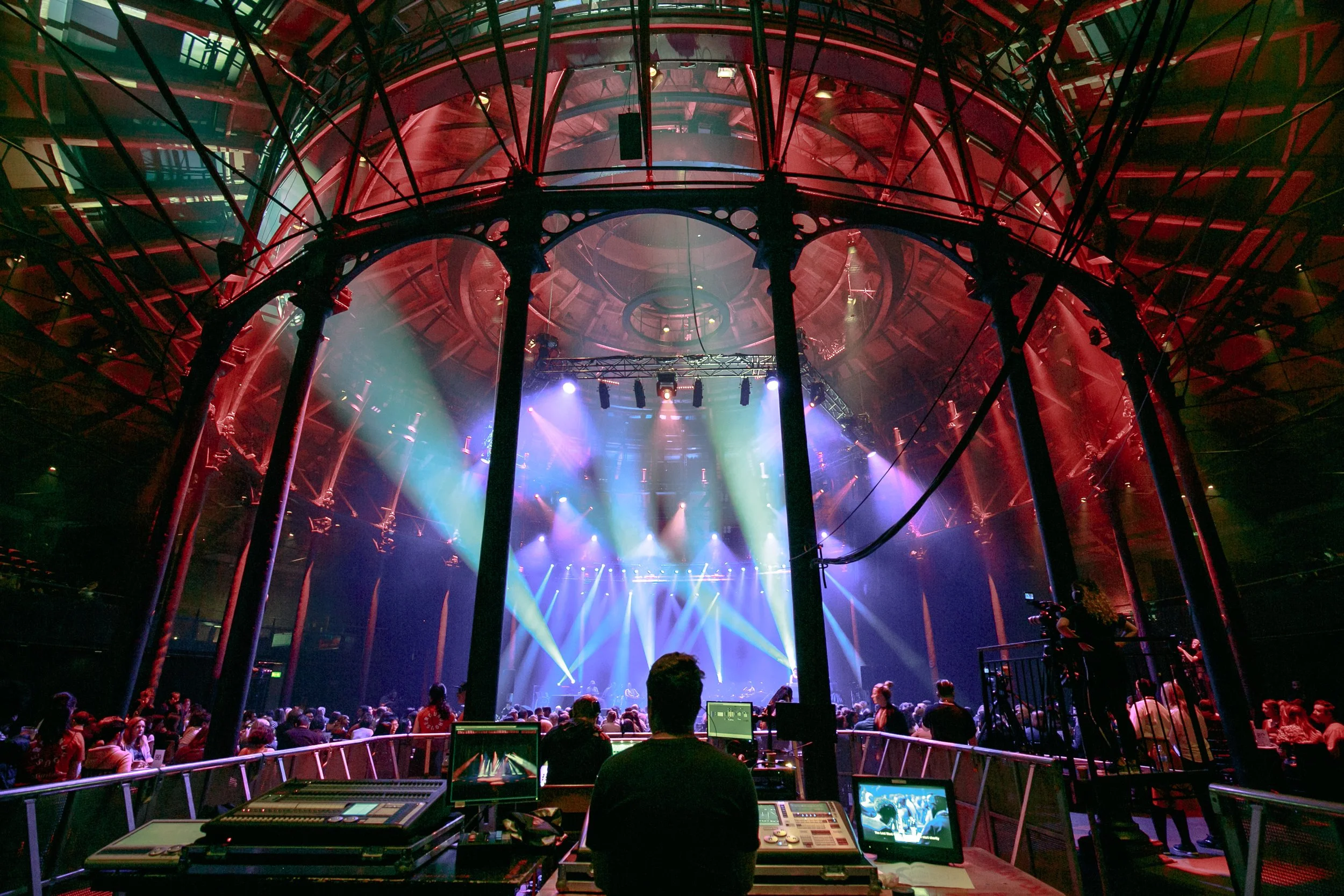
The Roundhouse London
Services
UX & UI // Web Development // Tessitura Integration
The client
The Roundhouse is an iconic music and arts venue in Camden, London. With a mission to raise the creative potential of the UK, they’re not only an active gig venue but are also working to open up space for creativity, empowering people and community.
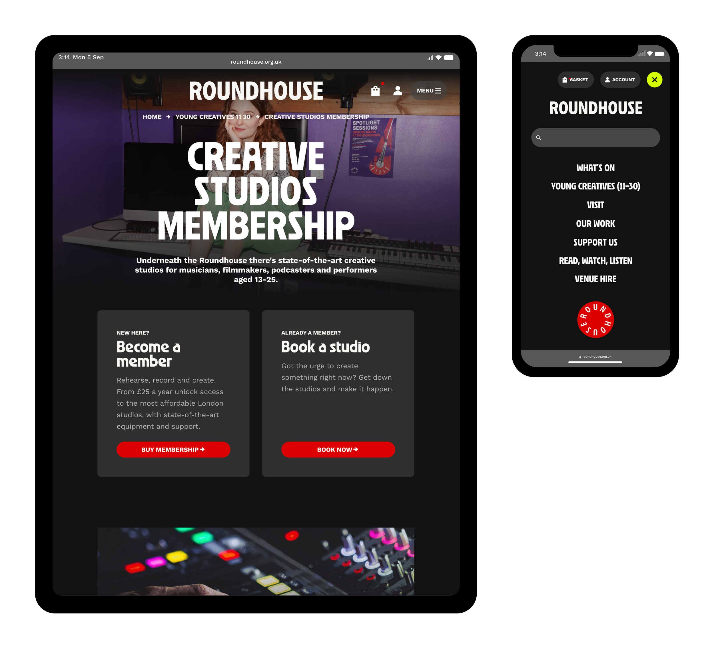
The Roundhouse has a strong and varied youth programme, as part of which young people can participate in workshops and rent out studio spaces.
The brief
Roundhouse came to After Digital seeking an agency to design and build a mobile first, user-centred, accessible and dynamic marketing site and purchase path, integrating with their ticketing system Tessitura.
With After Digital’s long established track record in the arts and culture sector, as well as our event management platform Skyway, we were the perfect candidate for the task, and were awarded the project.
Having completed a thorough initial research phase, we held a series of discovery sessions (moved online during the pandemic) to uncover requirements and map out the functionality and structure of the new site. At the same time, Roundhouse underwent a rebranding process with London-based creative studio Studio Moross.
Once the rebrand project had been completed, we looked to translate the new brand to the web. We created a set of wireframes and designs which were informed by the new brand principles, while also building on the requirements and insights gained during the pre-discovery and discovery phases.
Challenges
Roundhouse is a unique organisation in that it has a very wide array of programmes and activities. Within this, there are two distinct streams: gigs and events, as well as youth-oriented workshops and drop ins. There are also a number of studios which young people can rent out for band practices, to record podcasts, and more.
The previous site prioritised gigs over other types of events, making it difficult for young people to come across workshops and studio bookings organically. The booking journeys here also felt very different to those of booking a gig.
With the new site, we looked to address this disconnect, making it just as straightforward to book a workshop and hire out a studio, as it is to book gig tickets. We also worked to ensure that Roundhouse’s new brand would be translated truthfully not just on the marketing site but to the purchase path as well, creating a consistent, exciting and accessible experience throughout the site.
Key goals
1. Increase the visibility of workshops and other youth-focused events
2. Make functionally complex journeys feel quick and straightforward
3. Create a consistent brand experience
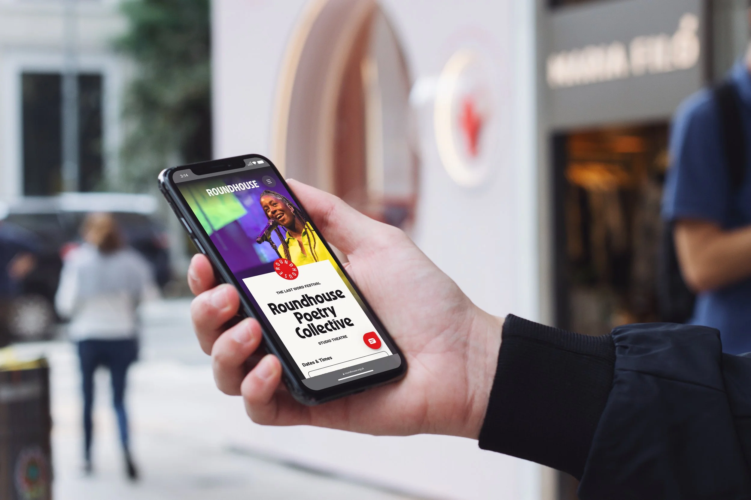
A new unified What’s On page
We added a hero section at the top of the What’s On page, which informs users about all the exciting gigs coming up at the Roundhouse, and also allows the venue to highlight special events.
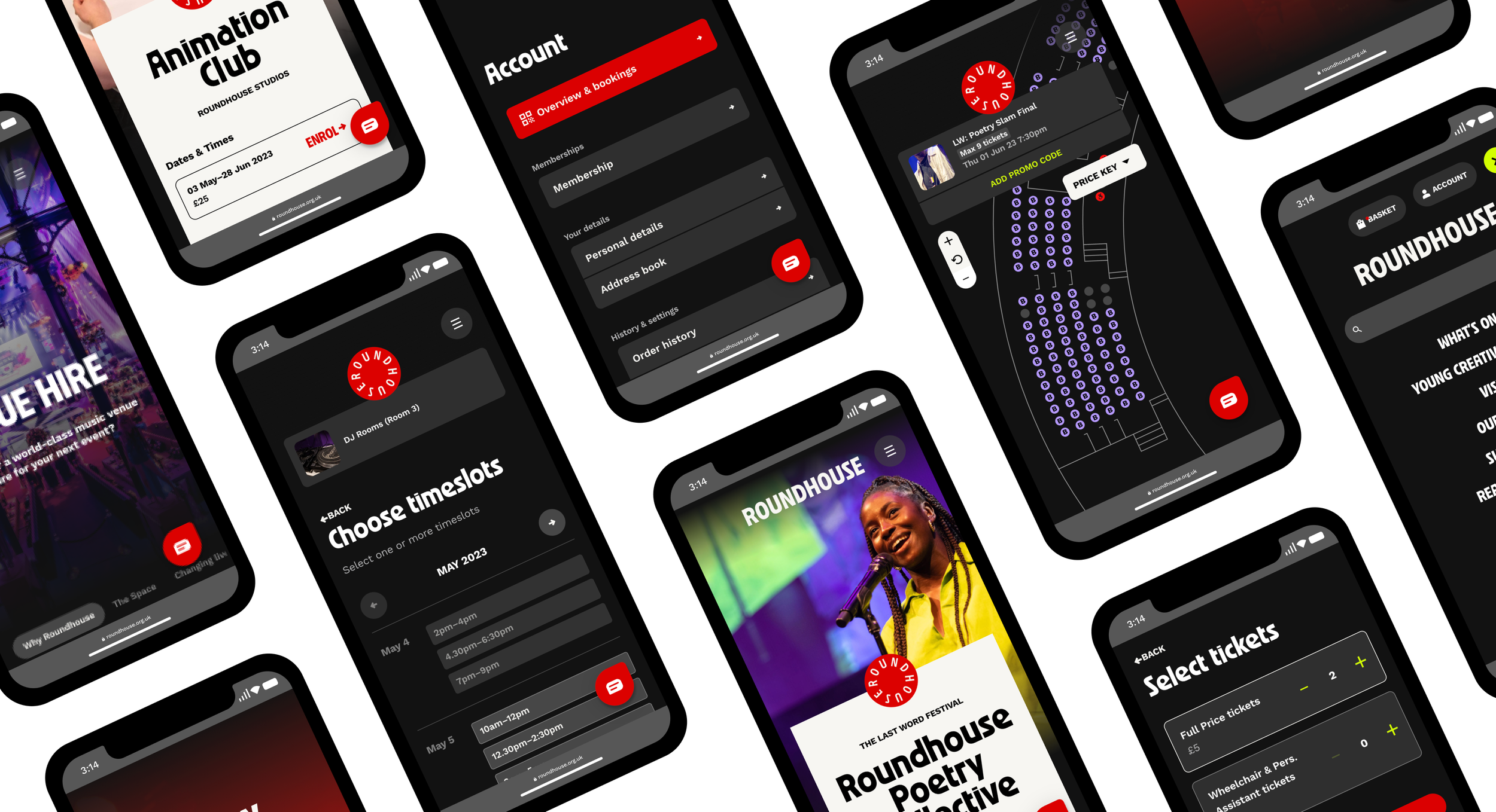
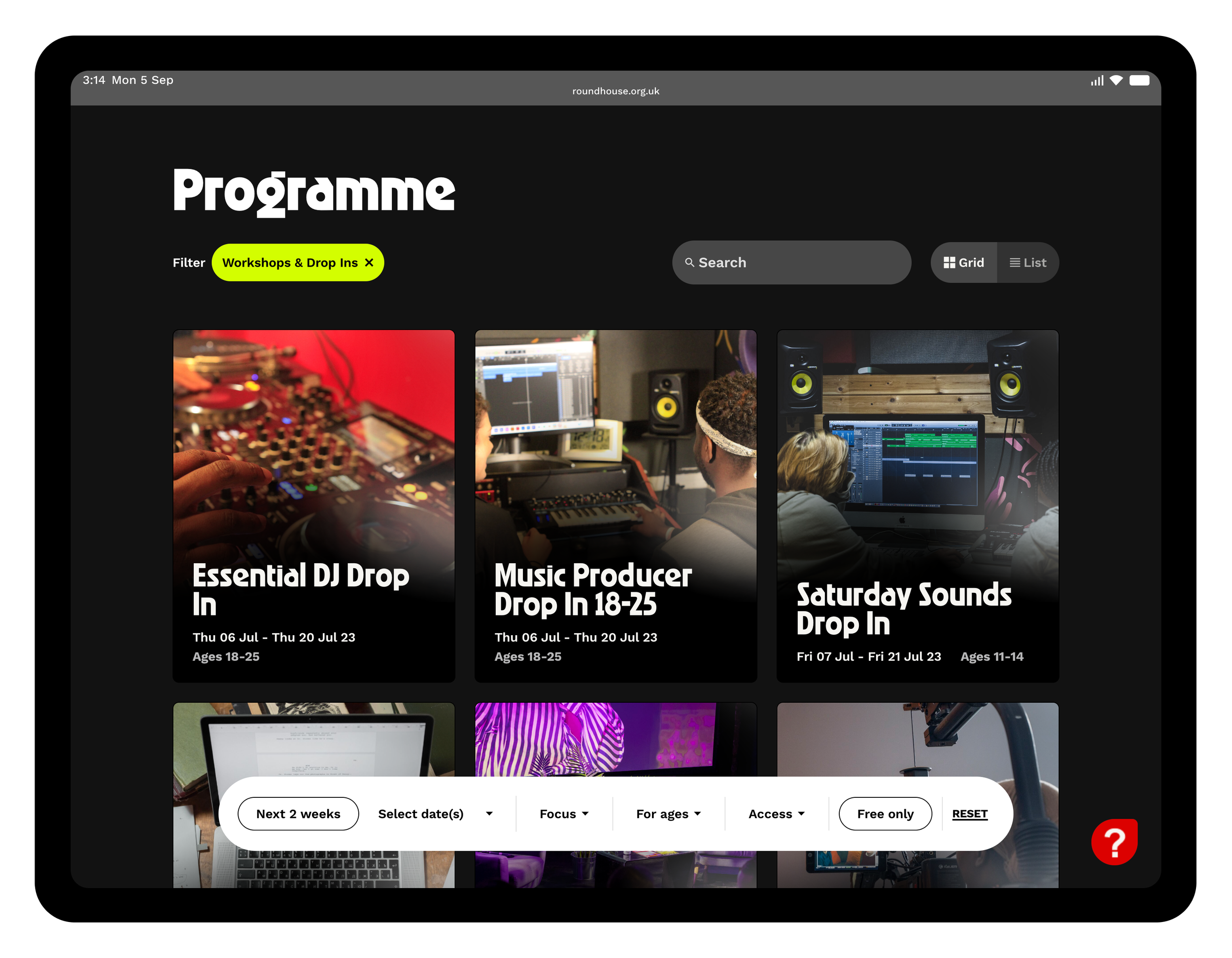
To address the issue of classes and other youth programmes being buried on the site, we decided to add these to the main section of the What’s On page alongside gigs and events, giving them their due prominence. Now, users can get a complete picture of everything that’s on at the Roundhouse at a glance. For users who are only interested in one of the two event types, a set of simple ‘mega filters’ allows them to quickly filter down to either gigs and events or workshops and drop ins.
A secondary set of filters allows users to further narrow down their selection, for example by a specific date or accessibility provision. These respond to whatever event type is selected—e.g. An age range filter which appears when the user has filtered for workshops and drop ins.
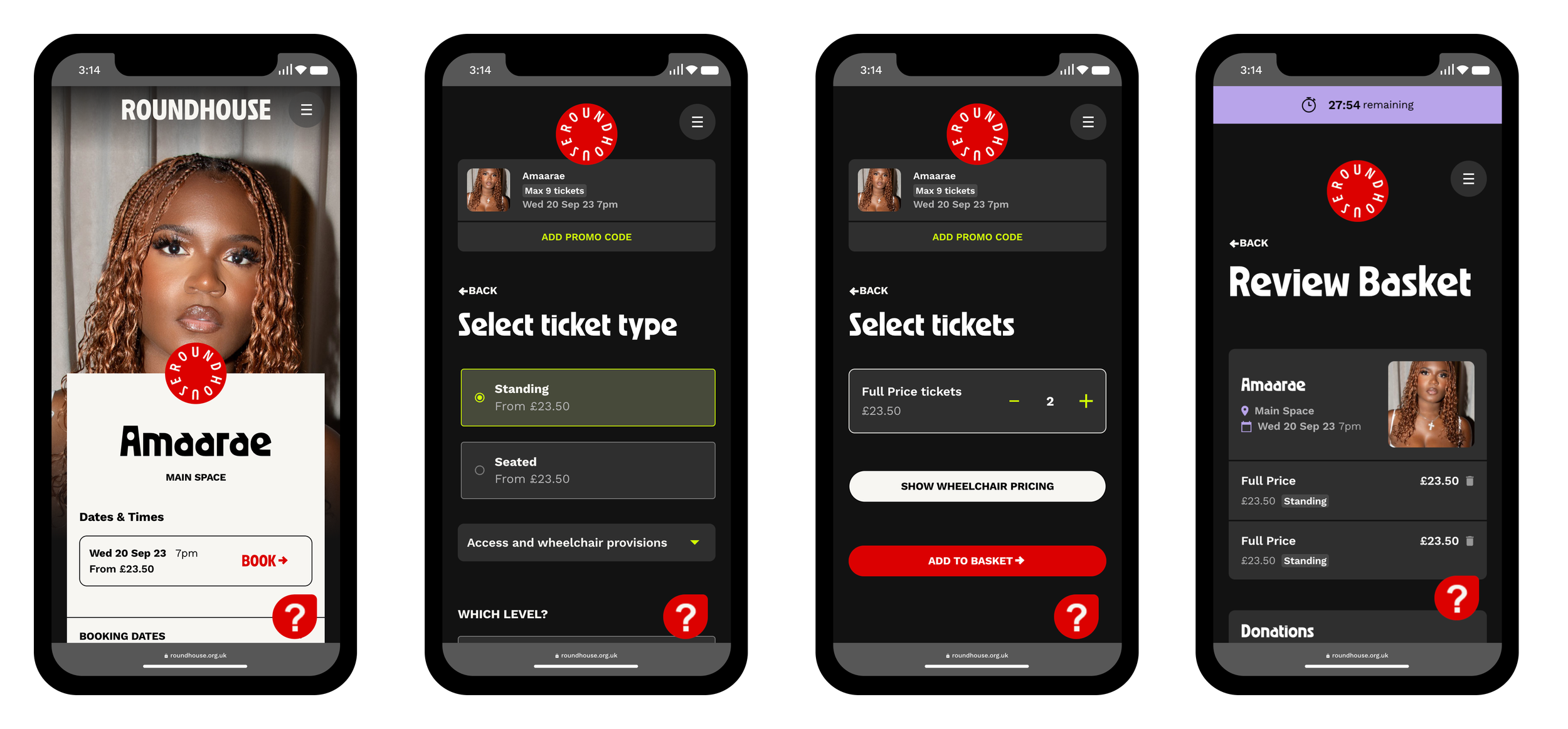
Complex journeys made easy
We completely refactored the ticketing journeys to be optimised for each event type, whether that’s a standing-only gig or a fully seated cabaret event—making purchasing tickets a breeze.
If both seated and standing tickets are available for an event, users can now choose between the two options as a first step, allowing those who are looking for standing tickets to circumvent the seat map entirely.
We used this ‘one step at a time’ approach for classes and studio hire journeys as well, thereby creating a consistent experience and reducing cognitive load.
The key info form, a health and safety form which has to be filled in when booking classes as a young person, is introduced post-basket, ensuring users only have to fill it in once per journey.
All of this functionality is powered by Skyway, After Digital’s own event management platform.
Skyway’s powerful CMS allows Roundhouse to administer event pages for gigs, classes and room bookings all from one easy location, striking just the right balance between automation and control.
Branded throughout
The new website brings to life Roundhouse’s new brand, as developed by Studio Moross. Taking the brand concept ‘Ignite’ to heart, it forms a major cornerstone of Roundhouse’s new look, broadcasting its mission and showcasing its events with impact and style.
The new site’s dark background allows high-impact imagery and bold text to take centre stage, all while optimising for usability and accessibility. Careful use of uppercase titles and centred content, combined with an extensive set of flexible content blocks work to create high-impact pages which let Roundhouse’s content shine, without compromising on readability. The new Read, Watch, Listen section forms a hub for the organisation’s digital outputs, inviting users to browse and discover.
The approach continues into the purchase path, where the same design principles are applied extensively but carefully, ensuring users can move through each step with speed and confidence.
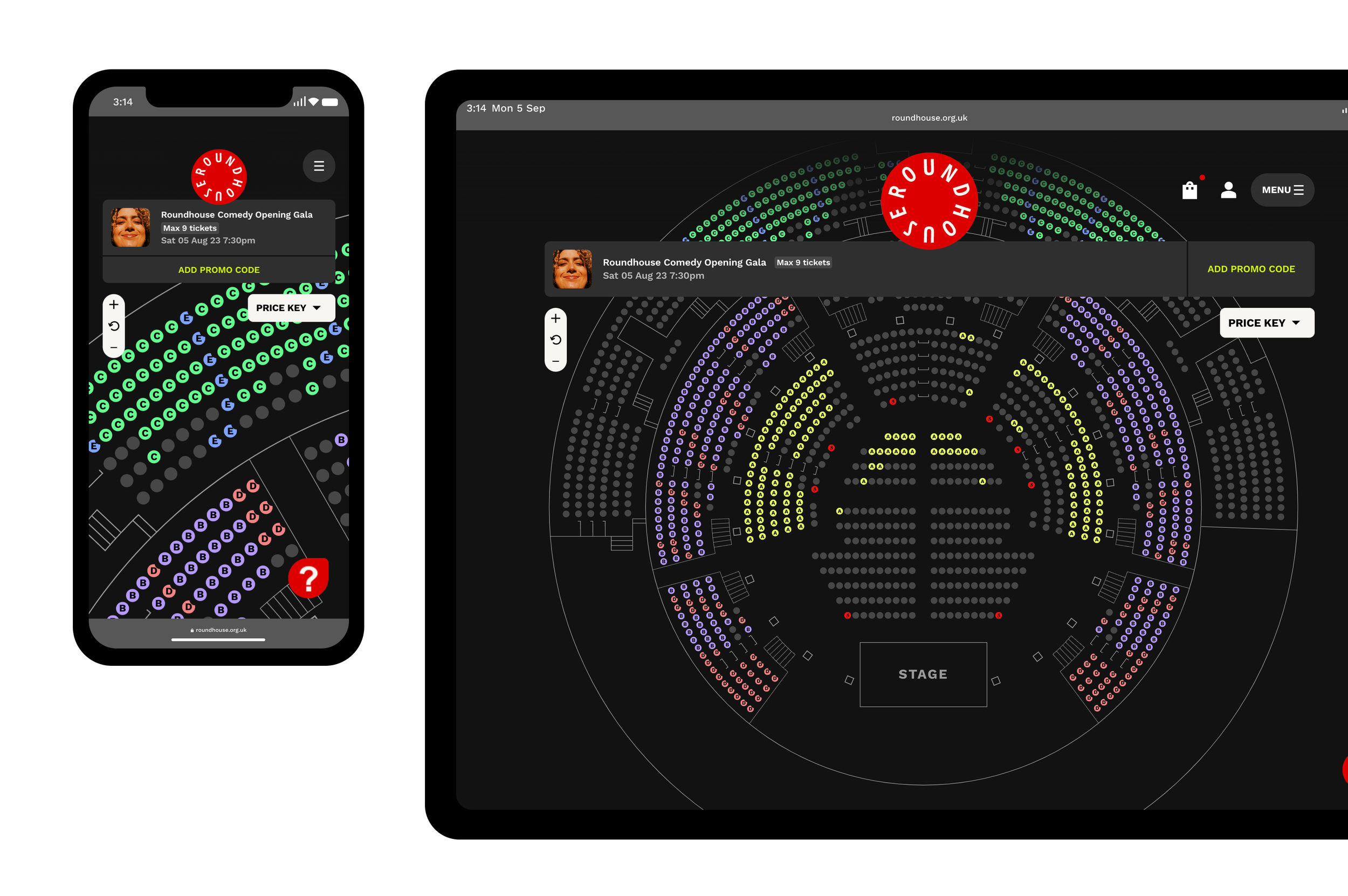
A better approach to seat maps
Roundhouse’s seated sections follow a curved layout (a feature not commonly supported by many seat map systems). We expanded on Skyway’s existing functionality to give us not only pixel-perfect control over the location of each individual seat, but also enable us to add contextual information such as the location of steps and visual obstructions into the seat map.
Additionally, each seat’s price is identified through a unique colour and letter, ensuring the seat map is accessible to colour-blind users. All of these elements work together to create a seatmap which is easy to parse and responds to the needs of a variety of audiences.
The rest of the UI on this page is kept as minimal as possible, giving users a full screen experience.
“This new website is designed with the user in mind, drastically improving the online experience for ticket buyers and young creatives. It comes at a time when we’ve also invested in a digital ticketing offer and a data project - ensuring we’re offering audiences a world-class digital experience at the Roundhouse.”
—Gary Halliday, Head of Systems and Technology, Roundhouse
Benefits and results
Usability and accessibility stand at the core of the new Roundhouse website—we believe that these shouldn’t hinder visual impact, but rather complement and build upon each other. Following WCAG 2.1 AA standards and building on insights from audience segmentation research, we designed a website which is joyful to use and can be navigated with minimal friction, creating a seamless experience for the widest range of users.
With on-sales happening almost weekly, Roundhouse’s site regularly sees incredibly high-traffic events where the site handles ~20k API requests per minute, meaning large amounts of data are loaded and processed continuously. We carried out extensive optimisation work on the amount of API calls made, resulting in an incredible 40% reduction.
This approach makes a big difference during busy on-sales, where the site frequently sees traffic spikes of over 4,000 users—who now complete their booking faster and more confidently, with purchase conversions up 15%.